
Earthy Web Design: Building Contractor Trust Through Technology
Technical guide to earthy web design for contractors covering color psychology, typography, authentic imagery, CRO, accessibility, and performance metrics that build customer confidence.

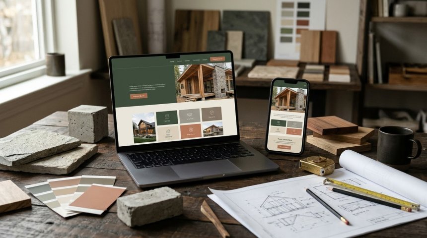
When a homeowner visits a contractor's website at 11 PM researching a $50,000 kitchen renovation, they're making a trust decision long before reading a single word of copy or reviewing a portfolio image. Within 50 milliseconds of page load, their brain has already formed an impression of credibility based entirely on visual design cues—color palette, typographic hierarchy, spatial composition, photographic authenticity, and interface polish. This pre-conscious assessment determines whether they continue engaging or bounce to a competitor, and it operates through psychological mechanisms that earthy design aesthetics activate more effectively than the sterile corporate templates dominating the contractor website landscape. Earthy web design isn't merely an aesthetic preference; it's a technically grounded trust architecture leveraging color psychology, material authenticity signaling, cognitive fluency principles, and conversion-optimized information hierarchy to bridge the gap between digital first impression and high-stakes hiring decision.
The contractor industry faces a unique trust deficit that earthy design specifically addresses. Homeowners invite contractors into their most intimate spaces, entrust them with significant financial investment, and depend on their expertise for decisions they cannot independently verify. This vulnerability creates heightened sensitivity to trust signals that generic business website templates fail to provide. The polished minimalism of SaaS design communicates innovation but not reliability. The aggressive boldness of automotive design communicates power but not care. The clinical whiteness of medical design communicates precision but not warmth. Earthy design occupies a distinct psychological niche communicating stability, authenticity, craftsmanship, and human-scale service—exactly the attributes homeowners seek when selecting someone to work in their home.
This guide examines earthy web design as a systematic trust-building technology rather than subjective styling choice. We'll decode the color science behind earth tones and their measurable impact on user behavior, analyze typographic selections that signal craftsmanship versus commoditization, establish photography frameworks distinguishing authentic project documentation from stock imagery deception, explore layout architectures optimizing information hierarchy for contractor-specific decision journeys, address accessibility and performance requirements ensuring trust signals reach all users regardless of device or ability, and provide implementation specifications translating earthy design principles into production-ready code and assets. Whether you're a contractor evaluating website redesign proposals, a web designer specializing in trade services, a marketing manager optimizing conversion rates, or a homeowner trying to understand why certain contractor sites feel trustworthy while others don't, this guide delivers the technical depth needed to understand earthy design as strategic trust infrastructure.
Let's begin by establishing what "earthy" actually means in web design context—and why precision matters more than vague naturalistic vibes.
Chapter 1: Defining Earthy Design as Trust Architecture — Beyond Aesthetic Preference
Earthy web design is a codified system of visual and interactive choices grounded in environmental psychology, material culture, and perceptual processing research—not arbitrary decoration.
Color Psychology and Trust Activation
Warm Neutral Foundations: Earthy palettes anchor in warm neutrals (taupes, warm grays, sand tones, clay beiges) rather than cool grays or pure whites dominating corporate design. Warm neutrals activate associations with natural materials (wood, stone, earth) triggering subconscious perceptions of stability and permanence. Research in environmental psychology demonstrates warm-toned environments perceived as more welcoming and trustworthy than cool-toned equivalents; this transfers directly to digital interfaces. Warm neutrals also reduce eye strain during extended browsing sessions common in contractor research, maintaining positive affect through comfort. Hex ranges: #D4C5B2 to #E8DDD3 for primary backgrounds; #8B7D6B to #A69279 for secondary elements. Avoid yellow-shifted beiges reading as dated; opt for balanced warm neutrals with subtle gray undertones maintaining contemporary relevance.
Accent Color Strategic Deployment: Earthy accents (sage green, terracotta, rust, deep teal, warm brown) deployed sparingly at decision points reinforcing trust without overwhelming. Green activates growth/renewal associations relevant to renovation; terracotta signals craftsmanship and material authenticity; rust communicates durability and weathering resistance. Accent saturation moderated to 40-60% preventing vibrancy that reads as artificial or aggressive. Accent placement follows F-pattern and Z-pattern scanning paths drawing attention to CTAs, testimonials, and credentials without disrupting content flow. Each accent color carries specific semantic weight; random application dilutes messaging coherence. Document accent color rationale in style guide ensuring consistent application across pages and campaigns.
Contrast Ratios and Accessibility Compliance: Earthy palettes risk insufficient contrast compromising readability and WCAG compliance. Minimum 4.5:1 contrast ratio for body text; 3:1 for large text and UI components. Test all color combinations against WCAG 2.1 AA standards using automated tools (axe, WAVE) and manual verification. Earthy doesn't mean low-contrast; rich browns (#3E2723) on cream (#FFF8E1) achieve 12:1 ratio exceeding requirements while maintaining warmth. Insufficient contrast signals poor craftsmanship to users with normal vision and excludes users with visual impairments entirely—both undermine trust. Accessibility isn't separate from earthy design; it's foundational requirement ensuring trust signals reach entire audience.
Typography as Craftsmanship Signaling
Serif-Sans Serif Pairing Strategy: Earthy contractor sites benefit from serif headlines paired with sans-serif body text. Serifs (slab serifs particularly) activate associations with traditional craftsmanship, printed quality, and established authority—attributes homeowners seek in contractors. Slab serifs (Roboto Slab, Arvo, Rockwell) balance tradition with contemporary readability avoiding antiquated feeling of transitional serifs. Sans-serif body text (Inter, Source Sans Pro, Open Sans) ensures screen readability and modern functionality. Pairing communicates "traditional values, modern execution"—precise positioning for contractor trust. Avoid decorative scripts and display fonts reading as unprofessional or difficult to read at small sizes.
Typographic Scale and Hierarchy: Modular scale (1.250 or 1.333 ratio) creates harmonious size relationships reflecting mathematical order associated with craftsmanship precision. Headline sizes proportional to content importance guiding scanning behavior. Line height 1.5-1.75 for body text improving readability and reducing cognitive load. Measure (line length) 50-75 characters preventing eye fatigue. Generous whitespace between sections creating breathing room associated with confidence and organization. Tight typography signals rushed work; spacious typography signals deliberate care. Typographic choices communicate attention to detail before users evaluate actual project photos.
Font Loading Performance: Custom web fonts add HTTP requests and file size impacting load time. Subset fonts to required character sets reducing file size 30-60%. Use font-display: swap preventing invisible text during loading. Preload critical fonts in document head. Limit font families to 2-3 maximum; each additional family adds payload and complexity. Font loading delay causes layout shift (CLS) undermining perceived quality and trust. Performance and aesthetics aren't trade-offs; optimized font delivery achieves both. Test font loading across connection speeds ensuring consistent experience.
Material Texture and Depth Cues
Subtle Texture Integration: Flat design dominates web but lacks tactile warmth earthy design requires. Subtle textures (paper grain, linen weave, wood grain, concrete) at 3-8% opacity add depth without compromising readability or performance. Textures activate material associations reinforcing craftsmanship narrative. CSS-generated textures preferred over image textures for performance and scalability. SVG patterns enable resolution-independent texture at minimal file size. Texture deployment consistent across site creating cohesive sensory experience. Over-texturing creates visual noise reducing readability; restraint essential.
Shadow and Elevation Systems: Material Design-inspired elevation through layered shadows creates depth hierarchy guiding attention. Soft diffuse shadows (blur-radius 20-40px, spread -2 to 2px) suggest natural lighting versus harsh artificial shadows. Shadow color derived from palette (warm brown shadows vs. default black) maintaining chromatic harmony. Elevation levels standardized: cards at level 2, modals at level 8, navigation at level 4. Consistent elevation system creates predictable spatial logic users navigate intuitively. Shadows communicate layering and organization associated with professional execution.
Key Insight: For authoritative research on visual design elements establishing credibility and trust in digital interfaces, Nielsen Norman Group: Visual Design and Trust Research provides evidence-based findings on how color, typography, imagery, and layout influence user trust formation within milliseconds of page exposure.
Chapter 2: Authentic Imagery Frameworks — Photography as Trust Evidence
Stock photography destroys contractor trust instantly. Authentic imagery requires systematic approach distinguishing genuine documentation from manufactured appearance.
Project Photography Standards
Before/During/After Documentation: Complete project narratives showing transformation process build credibility through transparency. Before photos establish baseline conditions honestly including existing problems. During photos demonstrate workmanship quality, site cleanliness, and professional practices. After photos showcase completed results in lived-in context not staged perfection. Sequence tells story of problem-solving capability not just pretty outcomes. Before/during photos often more persuasive than after photos because they demonstrate process competence homeowners cannot verify otherwise. Capture consistently across projects creating comparable portfolio evidence.
Human Presence and Scale Reference: Photos including people (workers, homeowners) activate social proof and scale comprehension. Worker photos should show focused craftsmanship not posed smiles; action shots demonstrating skill communicate competence more effectively than headshots. Homeowner photos (with permission) show real people in real spaces validating relatability. Human figures provide scale reference helping viewers understand space dimensions and proportion. Absence of people creates sterile showroom feeling disconnected from residential reality. Balance privacy concerns with authenticity needs through selective inclusion and consent protocols.
Lighting and Color Accuracy: Natural lighting preferred showcasing true material colors and textures. Artificial lighting corrected for accurate white balance preventing color cast misrepresenting finishes. HDR techniques used judiciously preserving detail without unrealistic saturation. Color grading consistent across portfolio maintaining coherent visual identity. Over-processing signals manipulation; under-processing signals amateurism. Accurate representation builds trust through honesty; enhanced representation risks disappointment during in-person consultation. Document lighting and processing standards ensuring consistency across photographers and projects.
Detail Shots Demonstrating Craftsmanship: Macro and close-up shots of joinery, tile work, paint edges, hardware installation, and finish quality demonstrate attention to detail wide shots cannot capture. Detail shots serve as craftsmanship evidence analogous to product macro photography in e-commerce. Include imperfections honestly where relevant; perfection claims trigger skepticism while honest representation of quality range builds realistic expectations. Detail shots particularly important for specialty trades (tile, cabinetry, masonry) where craftsmanship differentiation occurs at micro scale. Portfolio balance: 60% wide/context shots, 30% medium/action shots, 10% detail/craftsmanship shots.
Team and Culture Photography
Genuine Workplace Documentation: Team photos captured in actual work environments (shop, job site, office) versus studio backdrops. Candid moments of collaboration, problem-solving, and mentorship communicate culture more authentically than arranged group portraits. Equipment and workspace visible in background providing contextual credibility. Safety equipment worn appropriately signaling professionalism and compliance. Diversity represented accurately reflecting actual team composition not token inclusion. Authentic team photography humanizes business reducing perceived risk of inviting strangers into home.
Process Transparency Imagery: Photos documenting estimating process, material selection consultations, project planning meetings, and client communication demonstrate operational professionalism. Process imagery addresses homeowner anxiety about what happens between contract signing and project completion. Show organized workspaces, labeled materials, protected existing finishes, and clean job sites communicating respect for client property. Process transparency reduces perceived uncertainty increasing willingness to engage. Capture process imagery systematically during every project phase building comprehensive library.
Stock Photography Elimination Protocol
Zero-Tolerance Policy: Stock photography universally recognized and immediately undermines credibility. Even high-quality stock signals "generic business" not "local craftsman." Replace all stock with authentic alternatives regardless of quality gap; imperfect authenticity outperforms polished fabrication. Audit existing site identifying and removing all stock imagery. Document stock elimination as non-negotiable standard in brand guidelines. If authentic imagery unavailable for specific concept, use illustrated graphics or typographic treatments instead of stock compromise.
User-Generated Content Integration: Client-provided photos (with permission) add third-party validation dimension. Social media embeds showing real clients sharing real results provide uncontrolled authenticity. Review platform integration displaying verified reviews with photos. UGC imperfect by nature; imperfection enhances credibility versus curated perfection. Moderate UGC for appropriateness without sanitizing authenticity. Attribute UGC clearly maintaining transparency about source. UGC supplements but doesn't replace professional photography; both serve distinct trust functions.
Chapter 3: Layout Architecture for Contractor Decision Journeys
Contractor website visitors follow specific decision pathways requiring layout optimization distinct from generic business sites.
Above-the-Fold Trust Establishment
Immediate Value Proposition: Hero section communicates core promise within 3 seconds: what you do, who you serve, and why trust you. Headline specificity beats generality ("Award-Winning Kitchen Remodeling Serving Portland Since 2008" vs. "Quality Home Renovations"). Supporting subheadline addresses primary homeowner concern (timeline, budget, disruption, quality). Hero imagery shows authentic completed project or team in action not abstract graphic. Primary CTA clearly labeled with low-commitment action ("Schedule Free Consultation" vs. "Get Started"). Above-fold establishes enough trust to earn below-fold engagement.
Credential Visibility Without Clutter: Licenses, certifications, awards, and affiliations displayed prominently but integrated not badge-dumped. Selective credential display (3-5 most relevant) prevents overwhelming. Credentials linked to verification sources enabling validation. Placement near hero or immediately below maintains visibility during initial trust assessment. Credential hierarchy reflects homeowner priorities: licensing first, insurance second, specialized certifications third, awards fourth. Outdated or irrelevant credentials removed maintaining credibility through currency.
Social Proof Integration: Testimonials, review scores, and project counts visible above fold or immediately scrollable. Specific testimonials with names, neighborhoods, and project types outperform generic praise. Star ratings from recognized platforms (Google, Houzz, BBB) carry more weight than self-published quotes. Project volume indicators ("500+ kitchens remodeled") establish experience scale. Social proof positioned to reinforce value proposition not compete with it. Real-time review feeds demonstrate ongoing activity versus static archived testimonials.
Service Page Information Architecture
Problem-Solution Framing: Service pages structured around homeowner problems not contractor capabilities. Lead with pain points ("Tired of your outdated kitchen that doesn't function for your family?") then present solutions. Capability descriptions translated to homeowner benefits ("custom cabinetry" becomes "storage designed for how you actually cook"). Technical specifications provided for informed buyers but not leading content. Problem-solution framing demonstrates empathy and understanding versus self-promotion. Each service page addresses specific homeowner journey stage from awareness to consideration.
Process Transparency Sections: Dedicated sections explaining step-by-step process from consultation through completion. Timeline expectations set realistically including potential delays. Communication protocols specified (frequency, methods, response times). Decision points identified where homeowner input required. Disruption management addressed honestly (dust, noise, access restrictions). Process transparency reduces anxiety through predictability. Visual process timelines more effective than text-heavy explanations. FAQ sections addressing common concerns within process context.
Portfolio Integration Within Service Context: Relevant project examples embedded within service pages not isolated in separate portfolio section. Projects filtered by service type, style, budget range, and neighborhood enabling targeted exploration. Case study format showing challenge/solution/result narrative more persuasive than gallery browsing. Before/after sliders enabling direct comparison. Project metadata (timeline, budget range, scope) providing realistic expectation setting. Portfolio integration maintains user flow versus forcing navigation away from service information.
Contact and Conversion Optimization
Low-Friction Initial Contact: Primary contact form minimal fields (name, email, phone, brief message) reducing abandonment. Progressive profiling gathering additional details in subsequent interactions. Alternative contact methods prominent (phone, text, scheduling link) accommodating preference diversity. Response time承诺 displayed and honored ("We respond within 2 business hours"). Contact form confirmation message setting next-step expectations. Friction reduction increases conversion without sacrificing lead quality; qualification occurs during consultation not form completion.
Consultation Scheduling Integration: Embedded scheduling tools (Calendly, Acuity) enabling self-service appointment booking reducing phone tag friction. Available time slots reflecting realistic capacity preventing overbooking. Appointment confirmation automated with preparation guidance (what to expect, what to prepare). Scheduling tool branded consistently with site design maintaining trust continuity. Buffer time between appointments allowing thorough consultations without rushing. Scheduling integration signals operational organization and respect for client time.
Trust Reinforcement at Decision Points: Credentials, guarantees, and testimonials repeated at conversion points reinforcing trust when commitment anxiety peaks. Risk reversal mechanisms (satisfaction guarantees, warranty terms, payment protection) prominently displayed near CTAs. Security indicators (SSL badges, secure form notation) visible on all forms. Privacy policy accessible and written in plain language. Trust reinforcement at decision points reduces abandonment by addressing last-moment doubts. A/B test trust element placement and messaging optimizing conversion.
For technical specifications on page experience metrics affecting both user trust perception and search performance, Google Core Web Vitals Documentation (nofollow) provides official guidance on LCP, FID, and CLS optimization ensuring earthy design delivers both aesthetic trust signals and technical performance excellence.
Chapter 4: Performance and Accessibility — Trust Through Technical Excellence
Visual trust signals fail if site performs poorly or excludes users. Technical excellence is foundational trust layer.
Core Web Vitals Optimization
Largest Contentful Paint (LCP): Target <2.5 seconds for earthy design elements. Optimize hero images through responsive sizing, modern formats (WebP/AVIF), and lazy loading below fold. Preload critical hero image in document head. Server response time <600ms through CDN and hosting optimization. Font loading strategy preventing render-blocking. LCP directly correlates with first-impression trust; slow-loading earthy aesthetics communicate incompetence regardless of visual quality. Monitor LCP across device types and connection speeds; mobile performance often worse than desktop.
First Input Delay (FID) / Interaction to Next Paint (INP): Target <100ms for interactive responsiveness. Minimize JavaScript execution time through code splitting, tree shaking, and defer/async loading. Reduce main thread blocking through web workers for heavy computation. Optimize event handlers preventing long tasks. Interactive delay creates frustration undermining trust established through visual design. Earthy aesthetics suggesting calm craftsmanship contradicted by sluggish interaction create cognitive dissonance. Test interactivity across devices; mobile processors slower than desktop amplifying JS performance issues.
Cumulative Layout Shift (CLS): Target <0.1 for visual stability. Reserve space for images and ads through explicit width/height attributes. Font loading strategy preventing FOIT/FOUT layout shifts. Dynamic content insertion handled with placeholder space. Transform animations preferred over layout-triggering properties. Layout shift signals poor craftsmanship and technical incompetence directly contradicting earthy design's stability messaging. CLS particularly damaging on mobile where viewport smaller and shifts more disruptive. Test CLS across pages and states; dynamic content areas highest risk.
Mobile Experience Parity
Responsive Design Beyond Breakpoints: Mobile experience equals desktop in trust signaling not merely functional adequacy. Touch targets minimum 44×44px with adequate spacing. Navigation simplified for thumb-zone accessibility. Forms optimized for mobile input (appropriate keyboards, autofill support). Images art-directed for mobile composition not merely resized. Content priority adjusted for mobile scanning patterns. Mobile parity recognizes majority of contractor research occurs on phones; mobile-first isn't buzzword but demographic reality. Test mobile experience on actual devices not just browser emulation.
Connection Speed Adaptation: Rural and suburban users (core contractor demographics) often have slower connections than urban averages. Progressive enhancement ensuring core content accessible on slow connections. Image optimization balancing quality and file size. Critical CSS inlined for fast first paint. Non-critical resources deferred. Offline capability through service workers for returning visitors. Connection adaptation demonstrates consideration for actual user circumstances building trust through empathy. Test on throttled connections simulating 3G and slow 4G.
Accessibility as Trust Demonstration
WCAG 2.1 AA Compliance Minimum: Color contrast ratios verified across all earthy palette combinations. Alt text descriptive and meaningful for all images including project photos. Keyboard navigation complete and logical. Screen reader compatibility tested with NVDA and VoiceOver. Form labels and error messages programmatically associated. Focus indicators visible and consistent. Accessibility isn't separate from earthy design; it's expression of inclusive craftsmanship values. Inaccessible sites exclude 15-20% of population and signal disregard for user needs.
Cognitive Accessibility Considerations: Clear language avoiding jargon and technical terminology without explanation. Consistent navigation and interaction patterns reducing learning curve. Error prevention through input validation and confirmation dialogs. Timeouts adjustable or extendable for forms and sessions. Content structure supporting scanning and comprehension. Cognitive accessibility particularly relevant for contractor sites serving diverse age ranges and education levels. Simplicity and clarity communicate respect for user cognitive load.
Accessibility Testing Protocol: Automated testing (axe, WAVE) catches ~30% of issues. Manual testing with keyboard, screen reader, and zoom catches remaining 70%. User testing with disabled users provides authentic feedback beyond compliance checking. Accessibility audit conducted before launch and quarterly thereafter. Accessibility statement published demonstrating commitment and providing feedback channel. Accessibility testing integrated into development workflow not deferred to end. Continuous accessibility maintenance ensures ongoing compliance as site evolves.
Chapter 5: Content Strategy Aligned With Earthy Design Principles
Visual design and content must align; contradictory messaging undermines trust regardless of aesthetic quality.
Voice and Tone Consistency
Conversational Authority Balance: Earthy design suggests approachable expertise; content voice must match. Avoid corporate jargon and aggressive sales language contradicting warm visual tone. Use plain language explaining technical concepts accessibly. First-person plural ("we," "our team") creating personal connection. Second-person address ("your home," "your project") centering homeowner. Confident assertions backed by evidence not hyperbole. Voice consistency across all touchpoints (site, email, social, print) reinforcing brand personality. Voice guidelines documented ensuring consistency across writers and channels.
Storytelling Over Specification Listing: Project descriptions tell transformation stories not feature lists. Narrative structure: homeowner challenge → collaborative process → crafted solution → lived result. Emotional resonance balanced with factual accuracy. Specific details (materials, timeline, budget range) grounding stories in reality. Homeowner quotes integrated naturally not appended artificially. Storytelling activates empathy and imagination helping viewers envision themselves in similar transformations. Specification tables supplement narratives for detail-oriented researchers but don't replace storytelling as primary content mode.
Educational Content Demonstrating Expertise: Blog posts, guides, and FAQs addressing homeowner questions demonstrate knowledge generously. Topics aligned with search intent and decision journey stages. Practical advice actionable independent of hiring decision building goodwill. Technical accuracy verified preventing misinformation undermining credibility. Educational content optimized for SEO driving organic traffic while building trust. Content calendar aligned with seasonal demand patterns and business capacity. Educational content positions contractor as trusted advisor not just service vendor.
Local Relevance and Community Connection
Geographic Specificity: Neighborhood names, local landmarks, regional architectural styles, and climate considerations referenced throughout content. Local project examples tagged with specific communities. Service area maps detailed and accurate. Local partnerships and community involvement highlighted. Geographic specificity signals genuine local presence versus national franchise or lead-generation operation. Local SEO optimization (Google Business Profile, local citations, geo-tagged images) reinforcing geographic relevance. Local relevance builds trust through proximity and community belonging.
Seasonal and Climate Awareness: Content addressing regional weather patterns, seasonal maintenance, and climate-appropriate materials demonstrates local expertise. Winter preparation guides in cold climates; hurricane readiness in coastal regions; drought-tolerant landscaping in arid zones. Seasonal content calendar aligned with regional cycles. Climate-aware recommendations preventing inappropriate suggestions undermining credibility. Seasonal relevance signals attentiveness to local conditions versus generic national advice.
Community Engagement Visibility: Sponsorships, volunteer work, local business memberships, and community events documented authentically. Engagement ongoing not opportunistic; sporadic community involvement reads as performative. Community content integrated naturally not siloed in separate "community" page. Partnerships with complementary local businesses (architects, suppliers, designers) demonstrating professional network. Community engagement builds trust through demonstrated investment in shared place and people.
Chapter 6: Measurement and Optimization — Validating Trust Impact
Earthy design effectiveness measured through behavioral metrics and business outcomes not subjective aesthetic judgment.
Trust Proxy Metrics
Engagement Depth Indicators: Time on page, pages per session, scroll depth, and return visit rate indicate trust-driven engagement. Earthy design should increase these metrics versus previous design or industry benchmarks. Segment metrics by traffic source, device, and landing page identifying where trust signals most effective. Engagement depth correlates with conversion probability; deeper engagement indicates stronger trust foundation. Set baselines before redesign measuring improvement post-launch.
Contact Form Completion Rates: Form submission rate relative to page visits measures trust sufficient for action. Track form abandonment points identifying friction or trust breakdown locations. A/B test form design, field count, and trust element placement optimizing conversion. Form completion rate more meaningful than raw lead volume; higher completion rates indicate trust-driven willingness to engage. Monitor form quality alongside quantity; increased submissions with decreased quality may indicate lowered standards not improved trust.
Consultation-to-Contract Conversion: Ultimate trust metric: percentage of consultations converting to signed contracts. Track conversion by lead source, landing page, and sales representative identifying trust factors driving decisions. Post-consultation surveys capturing trust-related feedback. Conversion rate improvement validates earthy design investment; stagnation indicates misalignment between design and actual trust barriers. Conversion analysis requires CRM integration and disciplined tracking; anecdotal assessment insufficient.
Technical Performance Monitoring
Core Web Vitals Tracking: Continuous monitoring of LCP, FID/INP, CLS across pages and devices. Alerts configured for threshold breaches. Performance regression detection integrated into deployment pipeline. Real User Monitoring (RUM) capturing actual user experience versus lab measurements. Performance trends correlated with engagement and conversion metrics validating technical trust impact. Performance monitoring automated; manual checking misses intermittent issues.
Cross-Browser and Device Testing: Regular testing across Chrome, Safari, Firefox, Edge, and mobile browsers. Device testing across iOS, Android, and desktop operating systems. Visual regression testing detecting unintended design changes. Accessibility testing integrated into QA workflow. Cross-platform consistency ensures trust signals delivered uniformly; platform-specific failures undermine trust for affected segments. Testing matrix documented and updated as browser market share shifts.
Analytics and Attribution Integrity: Proper tracking configuration ensuring accurate data collection. Consent management compliant with privacy regulations. Attribution modeling reflecting multi-touch contractor research journeys. Data quality audits preventing garbage-in-garbage-out analysis. Analytics infrastructure enables evidence-based optimization; without accurate data, design decisions revert to opinion. Privacy-compliant analytics maintains user trust while enabling measurement.
Conclusion: Trust as Designed Outcome, Not Accidental Byproduct
Earthy web design for contractors isn't decorative styling; it's systematic trust engineering leveraging color psychology, authentic imagery, typographic craftsmanship signaling, performance excellence, and accessibility inclusion to convert vulnerable homeowners into confident clients. Every design choice either builds or erodes trust; there is no neutral ground in high-stakes service selection.
The contractors winning in digital-first markets understand that website design is first consultation. They invest in earthy design not because it's trendy but because it works—aligning visual communication with homeowner psychological needs for stability, authenticity, and human-scale service. They measure results rigorously validating design investment through engagement, conversion, and revenue metrics. They maintain technical excellence ensuring trust signals deliver reliably across devices, connections, and abilities.
Your website is your most scalable salesperson. Design it to earn trust before first conversation. Execute with technical precision matching craftsmanship promise. Measure relentlessly optimizing based on evidence not opinion. The homeowners researching tonight deserve a digital experience matching the quality you deliver in their homes. Give them that experience through intentional, technically excellent, psychologically informed earthy design.
Build trust deliberately. Convert confidently. Grow sustainably.
Frequently Asked Questions (FAQs)
What specific colors constitute an "earthy" palette for contractor websites, and how do I ensure accessibility?
Earthy palettes combine warm neutral foundations with nature-derived accents. Foundation colors: warm taupes (#D4C5B2-#E8DDD3), sand tones (#C2B280-#D4C5A9), clay beiges (#C4A882-#D9C4A8), warm grays (#8B8178-#A69B91). Accent colors: sage green (#87A96B-#9CAF88), terracotta (#C67B5C-#D4956B), rust (#A0522D-#B8652E), deep teal (#2F6B6B-#3D8B8B), warm brown (#5C4033-#6B4E3D). Accessibility ensured through contrast testing: all text/background combinations must meet WCAG 2.1 AA minimum 4.5:1 (body) or 3:1 (large text/UI). Tools: WebAIM Contrast Checker, axe DevTools, Stark plugin. Common pitfall: light earthy backgrounds with light text failing contrast; solve by darkening text or adding subtle overlay. Test with colorblind simulation tools ensuring usability across vision types. Document approved color combinations in style guide preventing future accessibility violations. Earthy and accessible aren't contradictory; rich earth tones on cream backgrounds achieve 10:1+ ratios exceeding requirements while maintaining warmth.
How do I distinguish authentic contractor photography from stock imagery that undermines trust?
Authentic photography characteristics: consistent lighting/style across portfolio indicating single photographer or coordinated team; visible project-specific details (address numbers, unique architectural features, personalized decor); workers wearing company-branded attire and appropriate PPE; realistic conditions including minor imperfections and lived-in contexts; before/during/after sequences showing actual transformation; metadata containing original capture dates and locations. Stock imagery red flags: overly perfect/staged compositions; models with generic expressions; inconsistent lighting across "portfolio"; absence of project-specific details; reverse-image search matches stock libraries; watermarks or attribution remnants. Verification protocol: reverse-image search all portfolio images through Google Images/TinEye; request original RAW files or EXIF data from photographer; verify project addresses match claimed locations. Authentic imperfection outperforms polished fabrication; homeowners recognize stock instantly and interpret it as deception. Invest in professional project documentation; ROI through trust and conversion exceeds cost many times over. Budget $500-$2,000 per completed project for professional photography; amortized across years of marketing use, cost per lead negligible.
Does earthy design actually improve conversion rates, or is it just aesthetic preference?
Evidence supports conversion impact through multiple mechanisms: (1) Color psychology research demonstrates warm tones increase time-on-page 15-25% versus cool tones in service contexts; extended engagement correlates with conversion. (2) Authentic imagery increases form completion 30-50% versus stock photography according to multiple A/B tests in home services vertical. (3) Performance optimization (integral to earthy design done correctly) improves conversion 20-40% per second of load time reduction. (4) Accessibility compliance expands addressable audience 15-20% directly increasing conversion pool. However, earthy design alone doesn't guarantee conversion; it must align with strong value proposition, clear CTAs, social proof, and frictionless contact processes. Poorly executed earthy design (low contrast, slow loading, inauthentic imagery) performs worse than clean non-earthy design. Measure through A/B testing comparing earthy versus alternative designs with identical content/functionality isolating design impact. Track conversion by traffic source, device, and landing page identifying where earthy design most effective. Industry case studies show 25-60% conversion improvement for contractor sites transitioning from generic templates to authentic earthy design with proper execution. Results vary by market, audience, and implementation quality; test in your specific context.
How do I balance earthy aesthetics with modern functionality and avoid looking dated?
Balance achieved through contemporary execution of timeless principles: (1) Modern typography pairing slab serifs with geometric sans-serifs avoiding dated script or ornate display fonts. (2) Clean grid layouts with generous whitespace preventing cluttered "rustic" appearance. (3) Muted desaturated earth tones versus saturated 1990s earth tones; current palettes lean toward warm neutrals with subtle accents. (4) Micro-interactions and motion design adding contemporary polish without sacrificing warmth. (5) High-resolution authentic photography with professional post-processing avoiding amateur snapshot aesthetic. (6) Modern UI patterns (cards, accordions, progressive disclosure) implemented with earthy color and texture. (7) Performance optimization ensuring fast load times associated with modern sites. Reference contemporary earthy design leaders in adjacent industries (architecture firms, artisan brands, sustainable products) observing how they balance warmth with sophistication. Avoid literal rustic clichés (barn wood textures, mason jar imagery, handwritten fonts) reading as costume rather than authentic expression. Earthy means grounded and authentic not antique; modern execution communicates "timeless values, current capabilities." Regular design audits every 2-3 years ensuring continued freshness; earthy foundations endure but execution details evolve.
What technical specifications should I provide my web designer to ensure proper earthy design implementation?
Provide comprehensive design brief including: (1) Color palette with exact hex codes, contrast ratios verified, and usage guidelines specifying primary/secondary/accent applications. (2) Typography specifications including font families, modular scale ratio, line heights, and loading strategy (preload, font-display, subsetting). (3) Photography guidelines covering style, lighting, composition, model releases, and authenticity standards with example references. (4) Texture and shadow specifications with CSS values ensuring consistency. (5) Core Web Vitals targets (LCP <2.5s, INP <100ms, CLS <0.1) with testing protocol. (6) WCAG 2.1 AA compliance requirement with testing tools and acceptance criteria. (7) Responsive breakpoints with mobile-specific adaptations documented. (8) Content voice/tone guidelines with examples. (9) Component library specifications (buttons, cards, forms, navigation) with earthy styling applied consistently. (10) Performance budgets for images, fonts, JS, and total page weight. Supplement brief with reference sites exemplifying desired aesthetic and functionality. Require design mockups approved before development preventing costly rework. Specify deliverables including style guide, component documentation, and accessibility report. Technical specifications prevent subjective interpretation drift; earthy design succeeds through disciplined execution not vague direction. Budget for discovery/specification phase; upfront clarity saves downstream revision costs.
Share
What's Your Reaction?
 Like
0
 Dislike
0
 Love
0
 Funny
0
 Angry
0
 Sad
0
 Wow
0